 Free Chrome extension · Responsive design tester
See your website on every screen at once
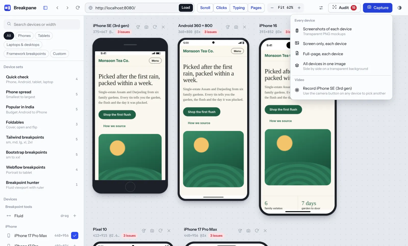
Breakpane opens any page on 75+ phones, tablets and laptops side by side. Scroll once and every device follows, find the exact width where your layout breaks, and export client-ready screenshots.
- 100% free
- No account
- Works on localhost
- Nothing leaves your browser
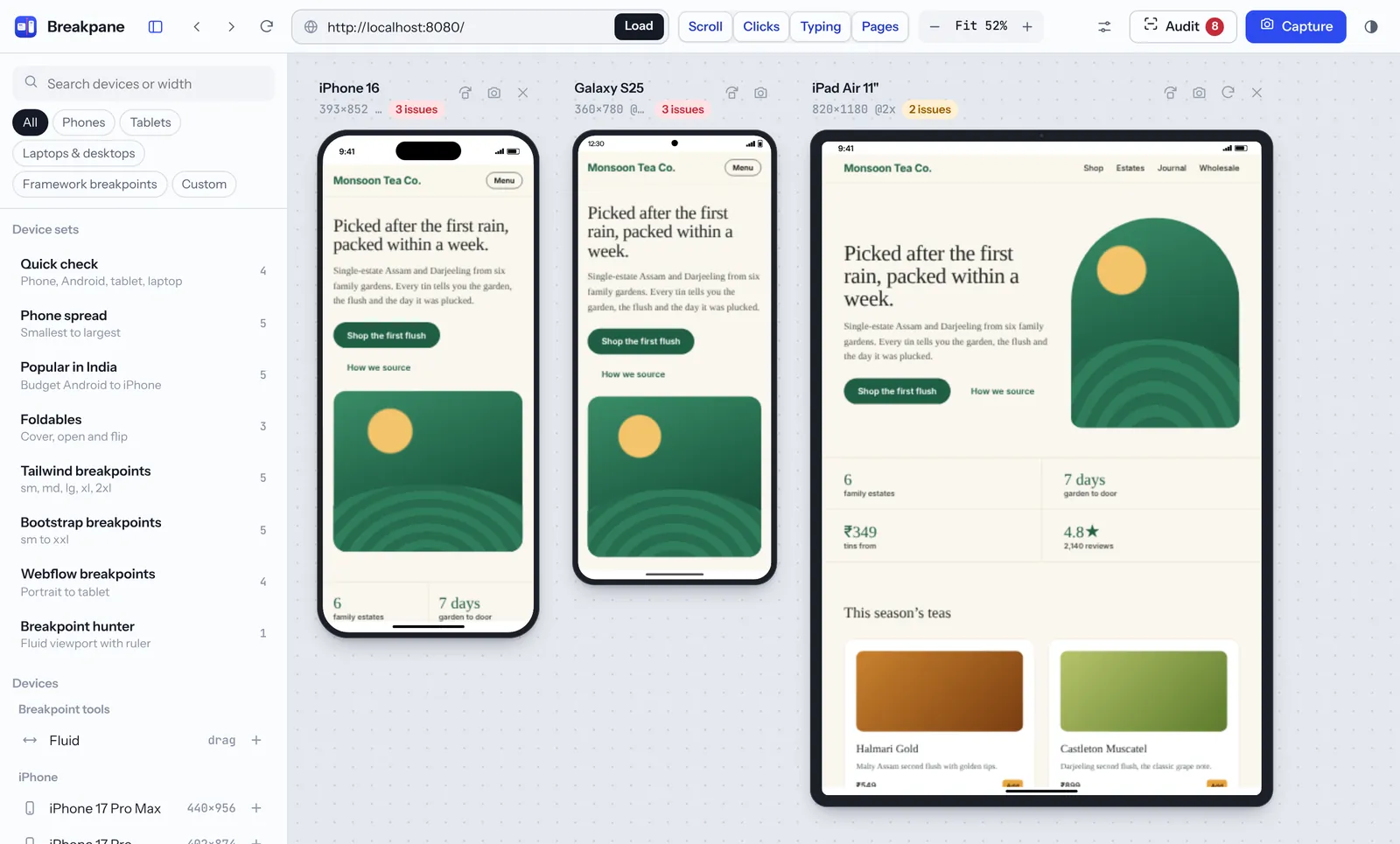
Everything you check before a launch, in one tab
Built for front-end developers, Webflow, WordPress and Shopify builders, designers, QA testers and agencies.
75+ real devices
iPhone 17 series to the SE, Galaxy, Pixel, Redmi, OnePlus, foldables, iPads, Surface, MacBooks and common laptop sizes.
Everything in sync
Scroll, click, type or follow a link on one device and every other device does the same. Back, forward and reload all at once.
Breakpoint finder
Reads the media queries in the page’s CSS, marks them on a draggable fluid ruler and tests one pixel either side.
Layout audit
Flags sideways scrolling and its cause, missing viewport tags, tap targets under 24px, tiny text and blurry images.
Realistic devices
Device frames with notch or Dynamic Island, browser-bar mode, and per-device user agent, touch, pixel ratio and rotation.
Screenshots and video
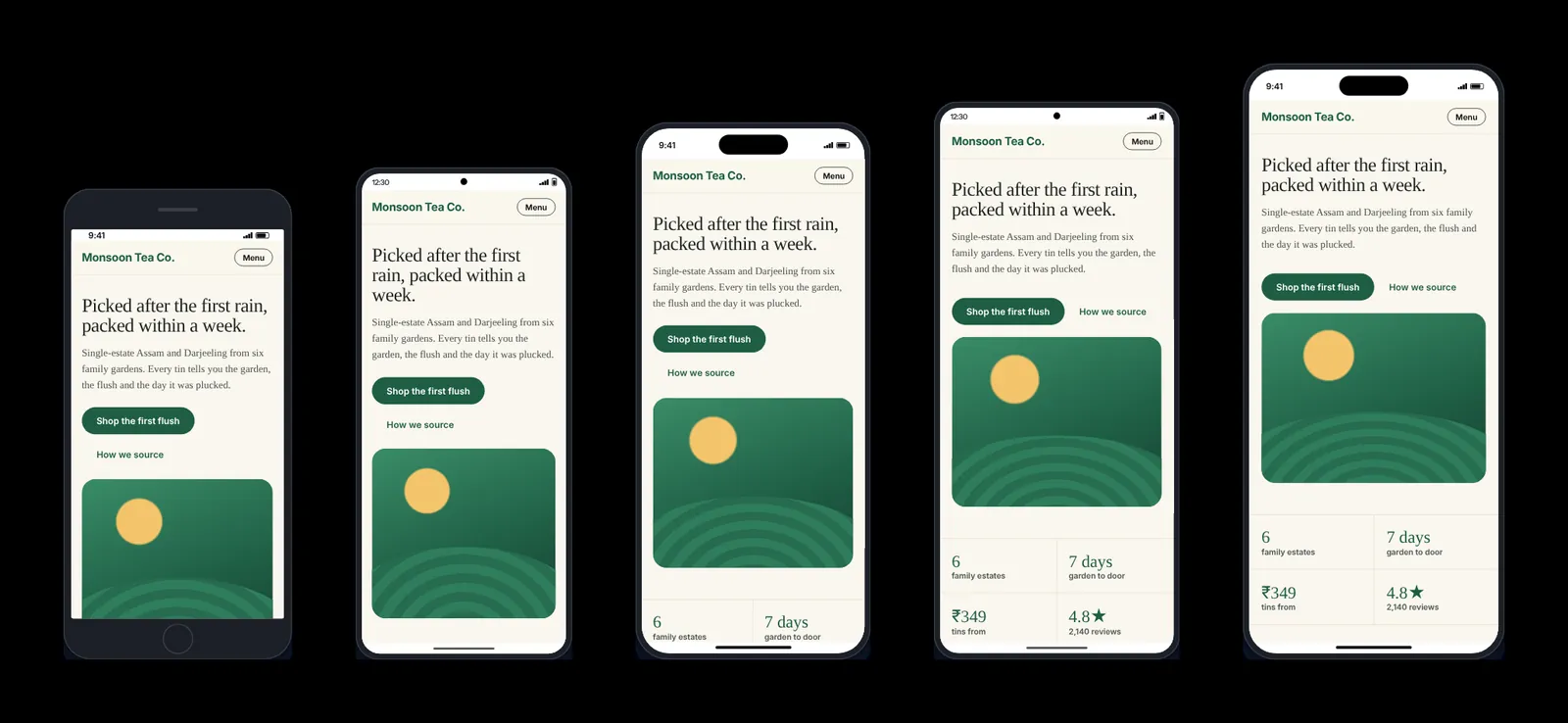
Transparent PNG mockups, stitched full-page captures, all devices in one image, and MP4 recordings.
See Breakpane in action
Click any screenshot to see it full size.
Every screen size side by side
Type any address, including a staging site or localhost, and Breakpane loads it on all your chosen devices at once.
- Ready-made sets: Quick check, Phone spread, Popular in India, Foldables
- Tailwind, Bootstrap and Webflow breakpoint sets
- Add custom sizes and save your favourites
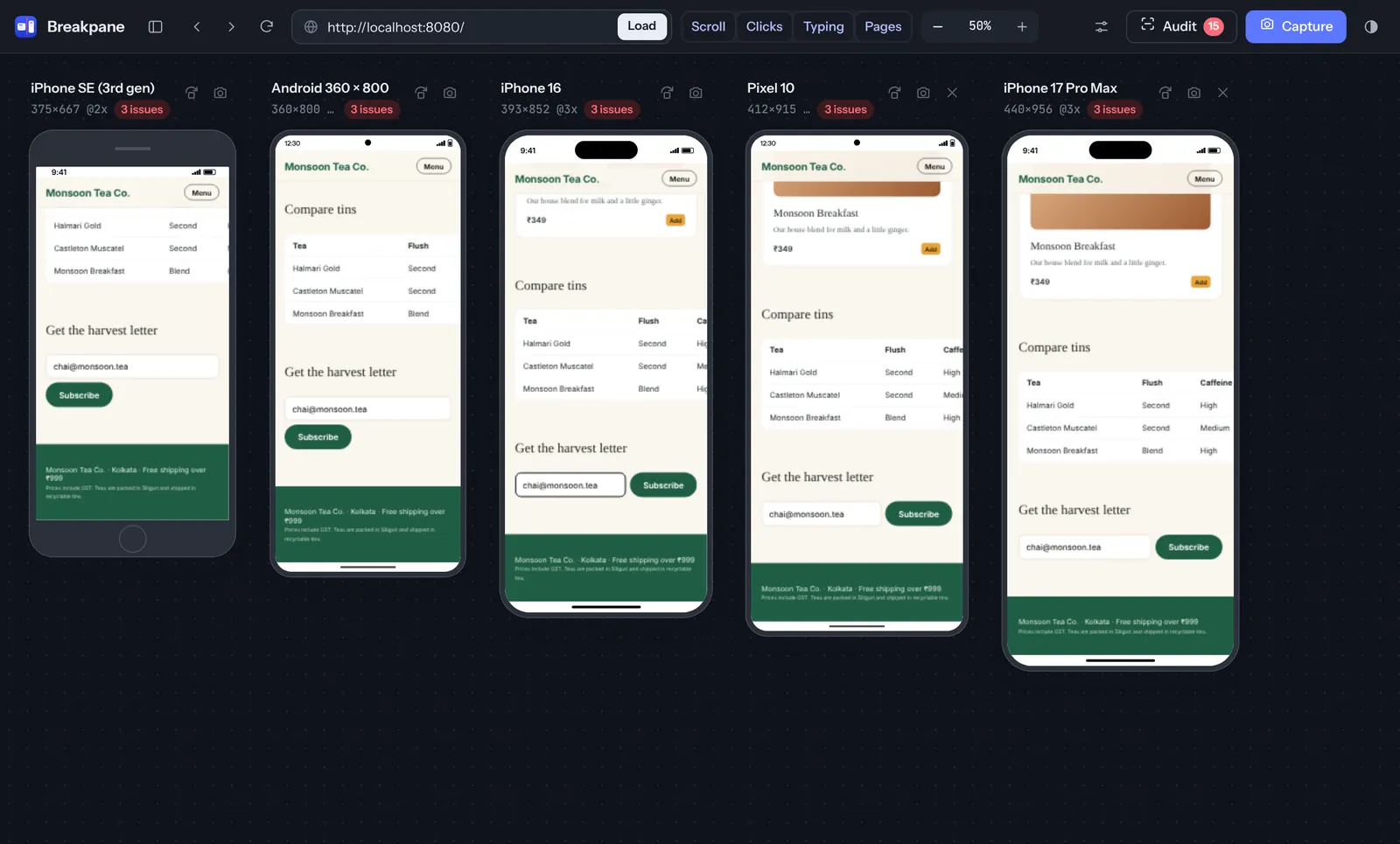
Test once, see it everywhere
Scroll, clicks, typing and page changes are mirrored on every device, so one pass through your site checks them all.
- Turn Scroll, Clicks, Typing and Pages sync on or off
- Dark device frames and dark mode preview
- Password and file fields are never synced
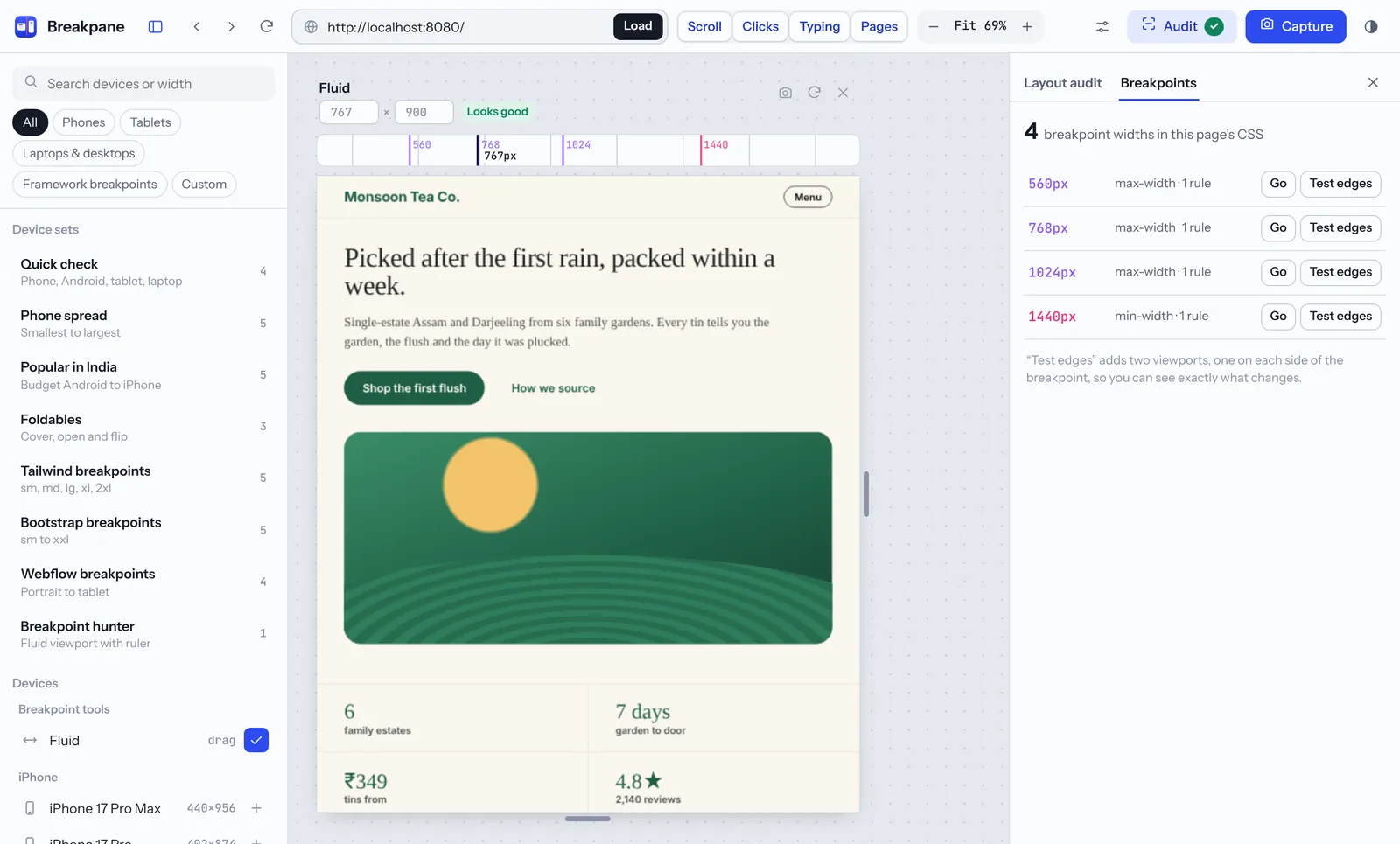
Find exactly where your layout breaks
Breakpane lists every breakpoint in the page’s CSS and puts a fluid viewport on a ruler you can drag pixel by pixel.
- Jump to any breakpoint with one click
- “Test edges” adds the widths just above and below
- Spot layouts that only fail between breakpoints
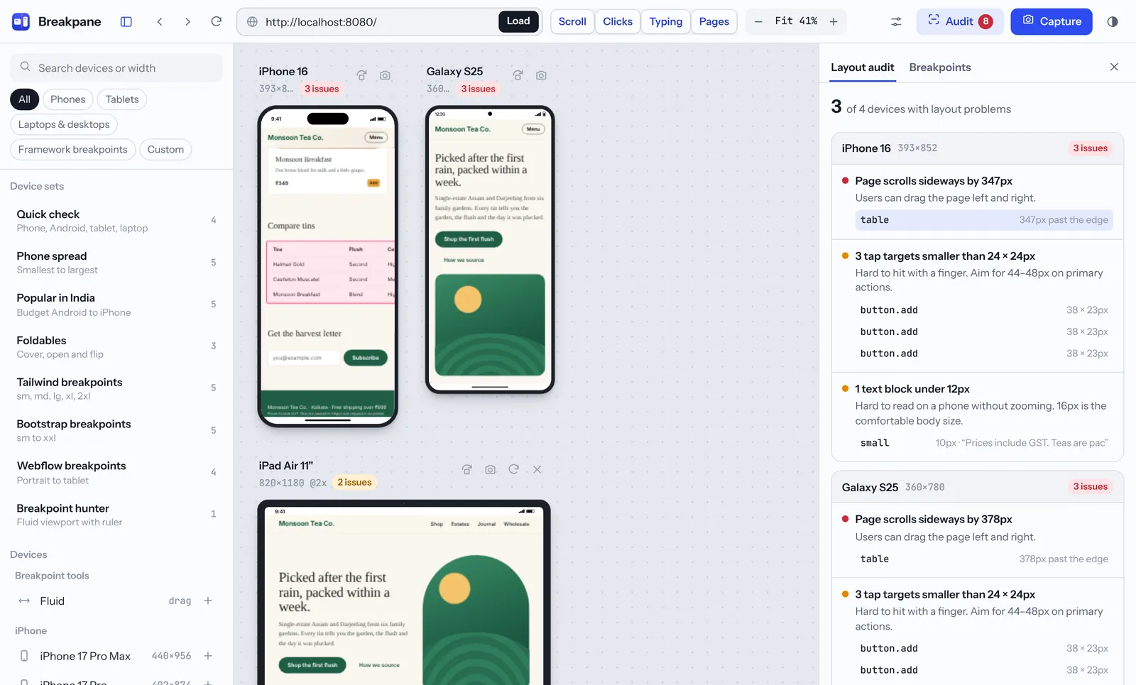
Catch mobile problems before your client does
Run the audit to check every device for the issues that most often break a mobile layout, then click an issue to highlight it.
- Horizontal overflow and the element causing it
- Tap targets under 24×24px and text under 12px
- Missing viewport tag and blurry images
Client-ready screenshots in one click
Export device mockups for proposals, bug reports and portfolio case studies, or record a short video of any device.
- Transparent PNG device mockups
- Full-page captures, stitched automatically
- All devices together in one image, or an MP4 recording
Install Breakpane in under a minute
Works in Google Chrome and other Chromium browsers such as Microsoft Edge, Brave and Opera.
Open the Chrome Web Store
Click Add to Chrome on this page to open Breakpane’s Chrome Web Store listing.
Click “Add to Chrome”
On the store page, click the blue Add to Chrome button.
Confirm
Chrome shows what the extension can do. Click Add extension.
Pin it to your toolbar
Click the puzzle-piece icon next to the address bar, then the pin beside Breakpane, so it’s always one click away.
Test a website in five steps
No setup and no sign-up. You can be testing within ten seconds of installing.
Open the page you want to test
Your live site, a staging URL or a local dev server such as localhost:3000.
Click the Breakpane icon
Choose Test this page, or start with a device set. You can also right-click and choose “Test this page in Breakpane”, or press Alt + Shift + B.
Allow website access once
The first time, click Allow website access so Breakpane can load the site inside its device frames. It only works inside the Breakpane tab.
Scroll, click and type
Use the page normally on any device and the others follow. Add or remove devices from the list on the left.
Audit, find breakpoints, capture
Use Audit to find problems, Breakpoints to test the edges, and Capture to export screenshots or a video.
Questions and answers
Is Breakpane free?
Yes. Every feature is free, with no account, no limits and no ads.
Does it send my pages or data anywhere?
No. Breakpane has no servers and no analytics. Pages load directly from their own sites in your browser, and screenshots are saved straight to your computer. Read the privacy policy.
Why does it ask for access to websites?
You choose which site to test, so Breakpane can’t know it in advance. Access lets it load that site in device frames, sync the devices and take screenshots. It’s optional, asked for only when you click “Allow website access”, and used only inside the Breakpane tab.
Is it a real iPhone or Android emulator?
No. Breakpane simulates screen sizes, user agents and touch inside Chrome. It doesn’t run Safari or Android, so do a final check on a real phone before launch.
Does it work with localhost?
Yes. Type localhost:3000 (or any port) in the address bar and every device loads your dev server.
Some sites don’t load in the frames. Why?
Breakpane can’t open browser pages (chrome://) or the Chrome Web Store, and a few sites block being shown inside frames in other ways. Most websites, staging sites and local servers work.
Ship layouts that work on every screen
Free, private and ready in seconds. Add Breakpane to Chrome and test your next page on 75+ devices at once.
Lavkush Kumar
Freelance full-stack developer with 7+ years of experience. I build fast marketing websites and landing pages in WordPress, Webflow, Shopify and Next.js, plus custom Chrome extensions like Breakpane.